Hero image
IDAN
Brand Identity · Luxury

IDAN

A regal feminine identity built through chromatic symbolism and hierarchy control — for a gift experience that feels magical, luxurious, and deeply intentional.

Type
Luxury Brand Identity
Client
Women's Gift Service
Name Origin
Yoruba — "Magic"

A LUXURY GIFTING IDENTITY

Logo Design Luxury Branding Visual Identity Chromatic Symbolism Packaging Campaign Design

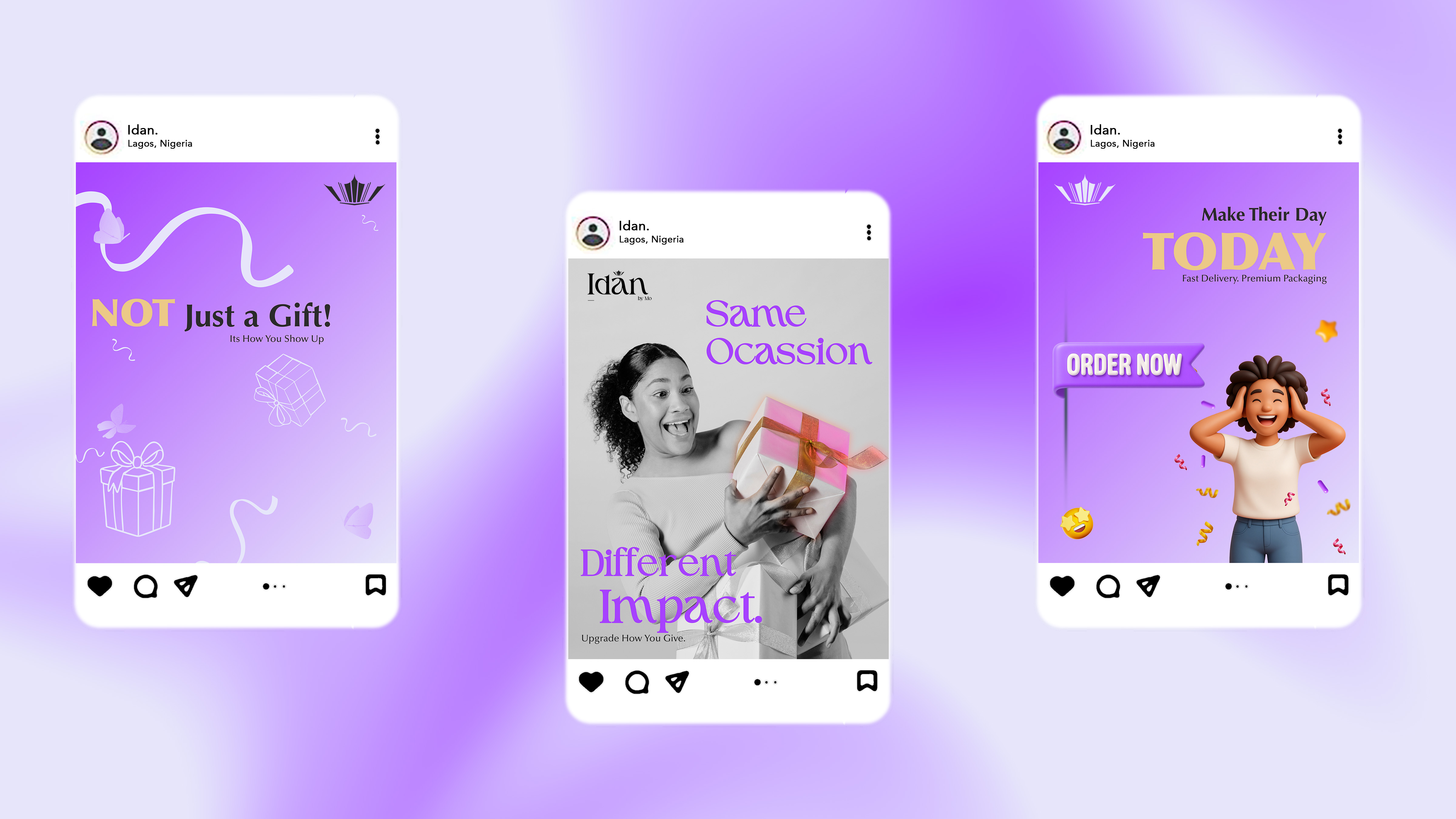
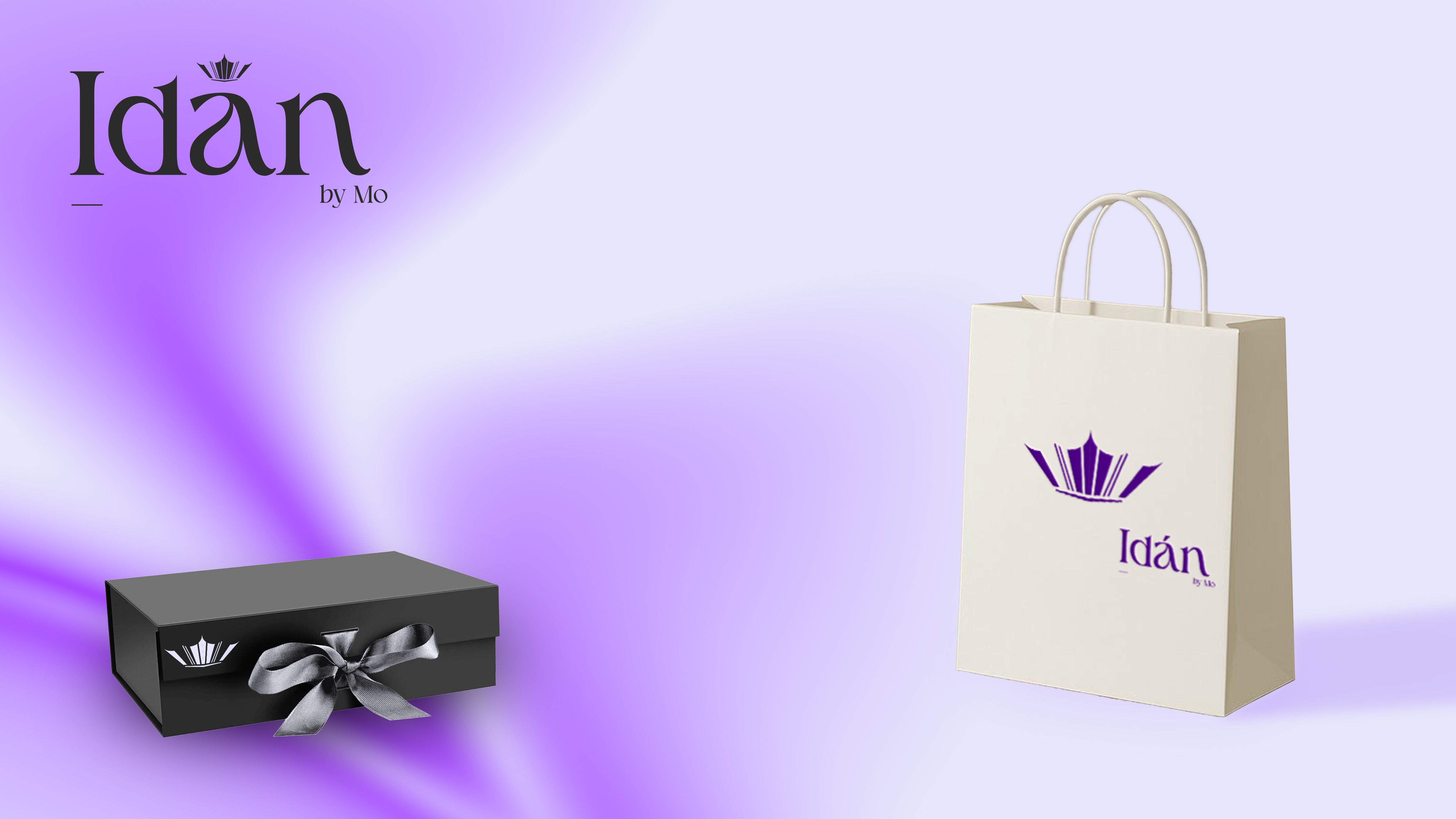
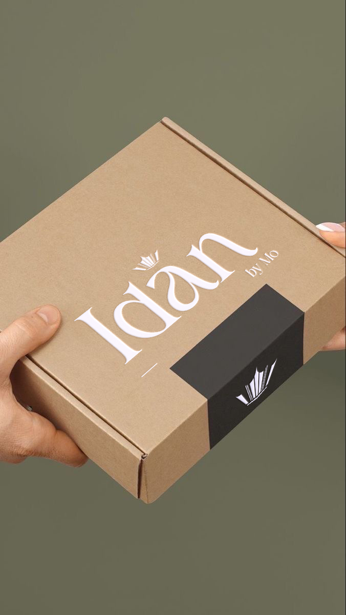
Idan is a women-only gift curation service specialising in premium gift packages presented in canvas totes with refined wooden accents — experiences designed to be unwrapped, not just received.

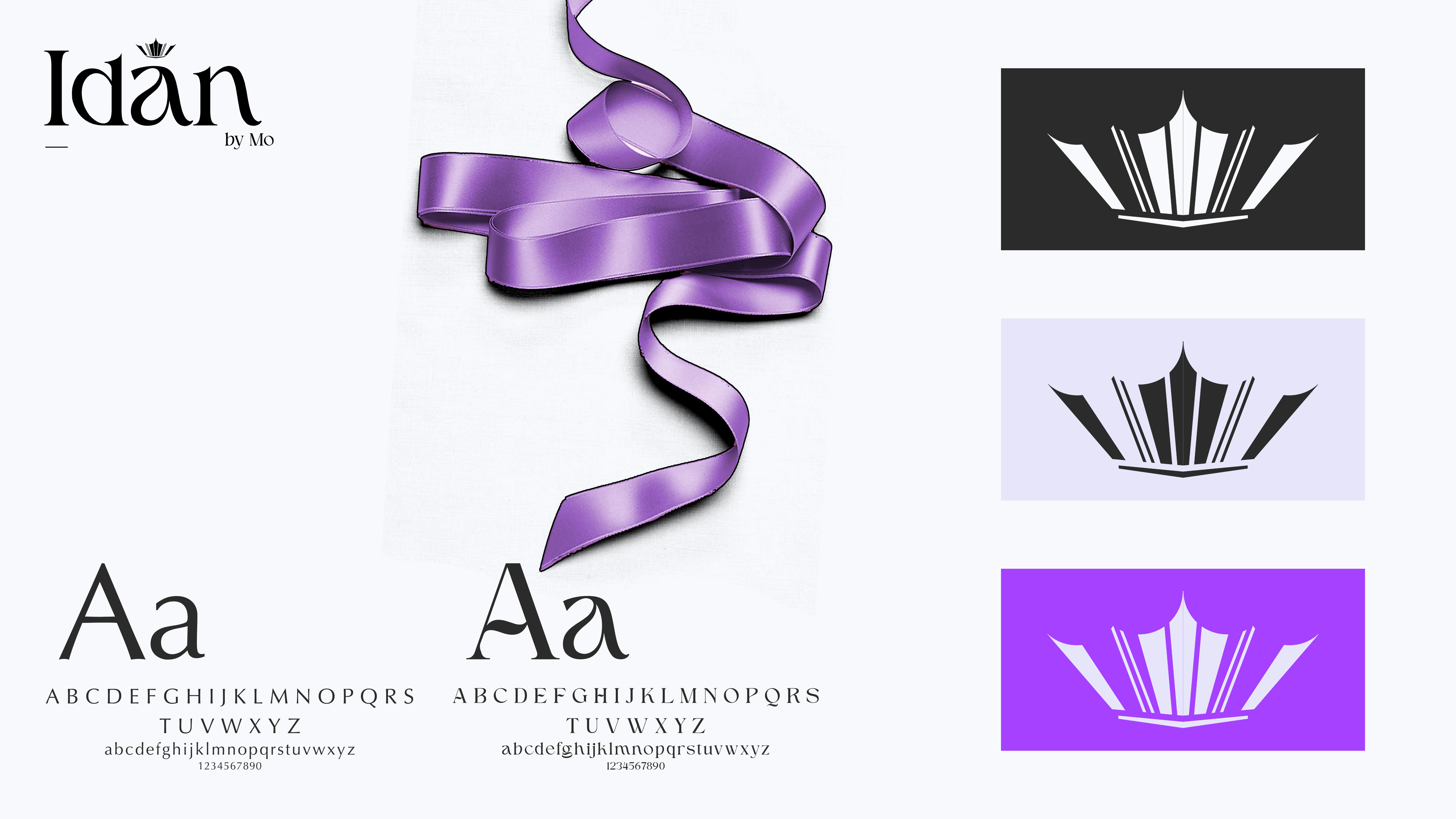
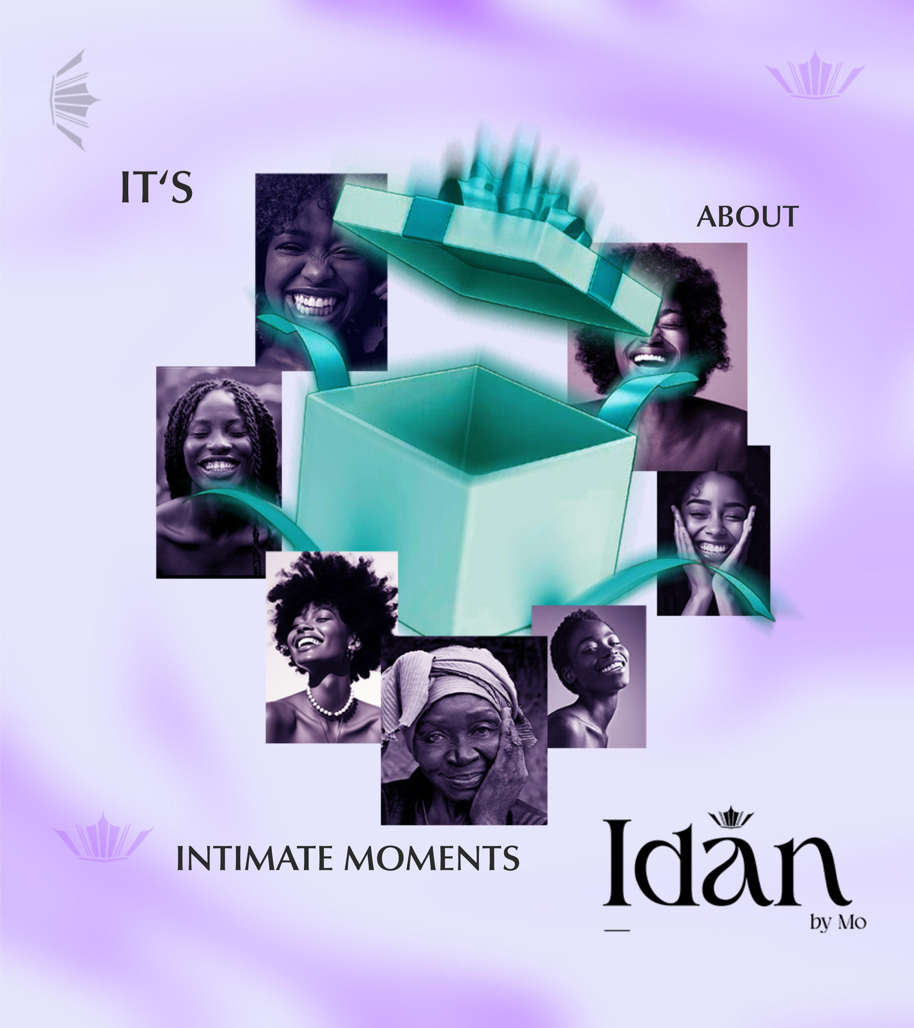
The brand name is derived from the Yoruba word for "magic," and that etymology informed the emotional core of every design decision. The identity needed to communicate royalty, sophistication, and warmth — simultaneously and without conflict.

The critical design driver was not decoration but hierarchy. In luxury, what receives emphasis and what gracefully recedes determines everything. Every element was assigned its place in the visual order, and nothing was permitted to compete for attention it had not earned.

Idan — Standalone Logo Mark

The standalone logo mark — designed to evoke quiet wonder without announcement

Idan — Wordmark and Logo

Wordmark with logo — the accent over the "a" references the original Yoruba diacritical marking, grounding the identity in its cultural origin

Luxury branding is rarely loud. Its power comes from what receives emphasis and what gracefully recedes.

HIERARCHY AS THE CORE DRIVER

01

CHROMATIC SYMBOLISM

Colour was selected not for aesthetic preference but for symbolic weight. Each hue carries a precise emotional signal — royalty, warmth, refinement, wonder — and those signals were mapped deliberately across the identity system.

02

HIERARCHY CONTROL

Every element in the system was assigned a clear visual rank. What leads, what supports, and what recedes were all considered decisions. Nothing competes for attention it was not given.

03

SUBTLE MAGIC

The magic the brand name references is not theatrical — it is quiet. The logo evokes wonder without declaring it. The luxury is felt before it is read.

04

FEMININE AUTHORITY

The identity is regal without being cold, premium without being exclusionary, and warm without sacrificing sophistication. It is designed for women, and it honours that audience at every touchpoint.

THE VISUAL LANGUAGE

Idan — Brand Identity System

Brand identity system — typography, colour swatches, and the core variables that establish the feminine regality of the brand

COLOUR, HIERARCHY, AND THE SCROLL STOP

Idan — Instagram Campaign

Instagram campaign — colour hierarchy and visual coherence working together to arrest attention. Private typefaces and brand-relevant visual elements communicate the nature and experience of the service before a single caption is read

THE BRAND IN SPACE

Idan — Billboard Campaign Mockup

Outdoor campaign mockup — designed for legibility at speed. Every element was considered for a driver's sightline: enough information to communicate fully, concise enough to read before it passes

Idan — Square Signpost Mockup

Square signpost — visible and readable from a distance as you approach the store

Idan — Storefront Signage Mockup

Storefront signage — positioned for maximum legibility from a direct frontal approach

PACKAGING, MERCHANDISING AND DIGITAL

Idan — Billboard Variant and Brand Merchandising

Billboard variant alongside branded merchandise and labelling — demonstrating how the identity scales across physical touchpoints

Idan — Box Packaging Mockup

Box packaging mockup — the brand identity applied to the product's primary vessel, ensuring the unboxing experience is as considered as the gift itself

Idan — Website and Favicon Mockup

Website mockup — careful consideration given to the favicon, ensuring full legibility at the smallest scale the brand will ever appear

MAGICAL. LUXURIOUS. INTENTIONAL.

The final identity system positions Idan as a premium gifting experience for women that feels magical, luxurious, and deeply intentional. From the logo mark to the packaging, from the storefront signage to the favicon — every element was resolved to the same standard.

The magic is not declared. It is demonstrated — through the precision of each decision, the restraint of what was left out, and the warmth of what was kept in. Not just a gift. A moment.

Next Project
GOMYCODE